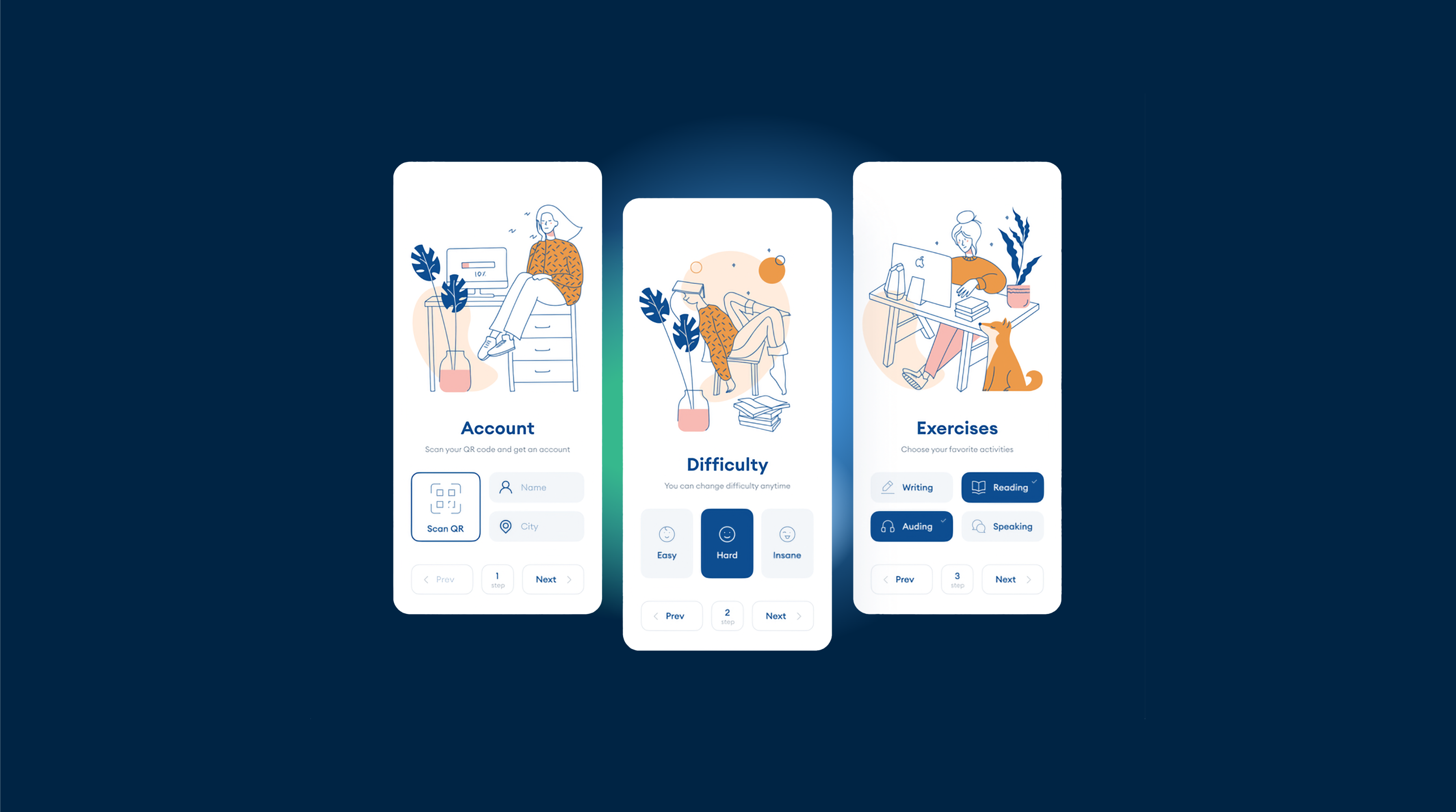
Basic JS and CSS Configurations for a Native App Look
When building a web app, it’s essential to make it look and feel like a native app to provide a seamless user experience. In this article, we’ll cover the basic JavaScript and CSS configurations needed to achieve a native app look, including disabling hover effects.
Disable Hover Effects
On touch devices, hover effects can be problematic as they don’t have a true hover state like desktop devices. To disable hover effects on touch devices, you can use the following CSS code:
@media (hover: none) {
  .element:hover {
    /* Reset the hover styles */
    background-color: initial;
    color: initial;
    /* Add any other style resets needed */
  }
}
Replace .element with the appropriate selector for the elements you want to disable hover effects on.
Disable Link Preview
To disable link preview on touch devices, you can use the following JavaScript code:
document.addEventListener('touchstart', function(event) {
  if (event.target.tagName === 'A') {
    event.preventDefault();
  }
});
Disable Selection
To disable text selection, add the following CSS code to your stylesheet:
body {
  -webkit-touch-callout: none;
  -webkit-user-select: none;
  -khtml-user-select: none;
  -moz-user-select: none;
  -ms-user-select: none;
  user-select: none;
}
Disable Zoom
To disable zooming, add the following meta tag to the head of your HTML file:
<meta name="viewport" content="width=device-width, initial-scale=1.0, maximum-scale=1.0, user-scalable=no">Add Safe CSS Zone
To ensure your content is displayed within the safe area of the device, add the following CSS code to your stylesheet:
body {
  padding: env(safe-area-inset-top) env(safe-area-inset-right) env(safe-area-inset-bottom) env(safe-area-inset-left);
}
Additional Tips
- Use responsive design techniques to ensure your app looks great on all devices.
- Optimize your app’s performance by minimizing the use of heavy JavaScript libraries and frameworks.
- Test your app on various devices and browsers to ensure compatibility and a consistent user experience.
By following these basic JavaScript and CSS configurations, you can create a web app that looks and feels like a native app, providing a seamless and enjoyable user experience.


